Curran Manzer and his taxidermy store

Curran Manzer – Owner of Curran’s Custom Taxidermy


I still remember the smell when I entered the taxidermy industry. It’s the smell that mixes fermented doughnuts and blood. I put up with the bad smell, smiled, finished the interview, went home, took all of my clothes off, and could not wait to have a bath. It was my first interview task that should be completed for a journalism class. And it was my first time to lean the word – taxidermy.

When I showed the project and shared the story to my host family, they were freaking out. They planned to find my tutor asking how was that possible to give students this kind of project when I said my tutor told me that hunting should be a way to keep the balance of eco system. They cannot stand the process of taxidermy, which include hunting animals, accepting the dead animal’s body on trucks from hunters, removing the skin of them, freezing dry the animals with a ground covered by animal oil and blood…

That is the first time that I leaned that hunting and taxidermy within limits are legal but controversial in America.

Curran is an unusually easygoing boss, which doesn’t even match his voice and image. In my imagination, he should be a man who will be as tough as Schwarzenegger. But he always smiled like a child especially when I told him that I could email him the video, however, he wrote my email address down because he didn’t have one, and he was going to create an email account.

His taxidermy skill was learned from his dad who was the owner of the store. When old Mr. Manzer passed, Curran expanded the store and started to take orders all around the world. He told me that he didn’t have much education, but he thought he would be cool if he sticked to one craftsmanship. I agree with him.

When I asked about the controversy of hunting and taxidermy, he smiled and said, ” you have to accept that there is life in the world that is different from your life, isn’t it?”

In China, hunting is totally illegal and taxidermy usually only happen in labs to serve museums for recording species. So I hadn’t seen any taxidermy displays in craft beer bars or in daily life in China. I didn’t know this culture. That is why I was super surprised when I learned that limited hunting and taxidermy is legal in America. My tutor told me that deer hunting sometimes should be a way to keep the balance of eco system because, for example, deer hunting could prevent widespread deer affect ranching and residents living.

Should we see the intervention of human as a part of eco system or it’s actually an action to break the balance of eco system?

For me, I just think this is interesting.

Guzheng—My Best Friend


close


Sitting in front of my Guzheng, I cannot help recalling all of the memories of learning this Chinese traditional musical instrument. My love of music and Chinese culture has motivated me to persist in playing the Guzheng for eighteen years, striving for mastery. There were many ups and downs during those eighteen years with tears of sorrow and joy, along with moments of solitude and reflection. Yet, all the challenges during the process have made me stronger, and the Guzheng, has become my best friend.

IMG_8820

The Guzheng should be one of the oldest traditional musical instruments in China. Can you imagine that it has a history of 2000 years? As Lu introduced on the Chamber Music Blog, “The Guzheng is a plucked zither instrument that originates from ancient China, and dates back to early forms of the instrument in the Warring States period, 475 – 221 BCE. It was the most popular instrument in China in the Qin period and Tang Dynasty.”

You haven’t heard about it before? Let me show this gorgeous instrument to you!

7.pic_hd

8.pic_hd

Modern Guzheng usually has 21 strings with 21 movable bridges as well. Strings were made from silk but now are mostly made from nylon in order to increase the capability.

9.pic_hd

We play it with eight fake picks, which will be taped around fingertips when we pluck the strings. But my fingers are still going to be hurt if I practice it a lot because we have to press the strings on the left side of the Guzheng to create the sound of “Fa” and “Xi”.

It’s a solo instrument but we also play it often with other traditional instruments and even western instrument. Isn’t it cool to combine Chinese traditional music with western music? Check it out to enjoy the piece, which is also a piano concerto that is called Tune of Rainbow Cloud  that was played by me on my second recital. Also, there is another piece called West Capriccio, which was played by Guzheng and Djembe on my second recital as well.

4.pic_hd

3.pic_hd

Guzheng makes me still be special.  Although I was forced by my “tiger mom” to learn it when I was four, I truly appreciate her decision. I cannot imagine my life with Guzheng.It is a language for me except English to communicate with native speakers. It is a tool to relax myself out of my stressful coursework. And it is a true friend that always stays with me.

If you are interested in listening more, click the links below for more pieces that were played by me on my first recital several years ago. Hope you love this traditional Chinese instrument after reading this article.

Fantasia

Yili Riverside

The Fragrant Jasmine

Yi Dance

Early Spring Jokul


END

side

Four techniques about providing confident presentations for non-native speakers

As an international student, a presentation means different in some extent compared with native students. Language can be the first gap. Humor and flexibly are also counted as the other difficulties due to language. From my own experience, there are still a lot of things you can work hard on so that you can still provide a proper and good presentation to your audiences. Combined with several good points from the article Matt Abrahams: Tips and techniques for more confident and compelling presentations, I would like to recommend several techniques to non-native speakers that are really effective for providing a good presentation.

  1. Clear pronunciation. Probably your pronunciation is not that standard as native speakers. But, it is your responsibility to make sure that your pronunciation is clear and the speaking speed is proper. And you know, the faster you speak, the higher risk of making grammar mistakes.
  2. Use variation in sight and sound to make your speak memorable. Everyone knows that we should make eye contact with audiences. It is the most important and effective way to connect with your audiences to feel their attitude and reflections. For non-native speakers, it will be much more helpful if you vary your voice and sight when you tend to speak key words.
  3. The right way to practice. I agree with this idea entirely. An effective practice will deliver a good presentation. Matt Abrahams suggests that “many presenters don’t practice properly…they simply mentally rehearse or flip through a slide deck, passive approaches that don’t really simulate the conditions of a presentation.” Native speakers should   practice well not mention to non native speakers. A good practice not only can give you confidence but also can increase your ability to make immediate response. I strongly recommend that you should stand up or even stand in front of a mirror to present. That will also help you to remember what you intend to say efficiently. And remember, thinking through a presentation by brain is not enough.
  4. Knowing the power of the paraphrase. It is worthy to be a good habit to keep for international students and non-native speakers. When you face a long or hard question, your proper paraphrase will help both of you and the questioner a lot.  After your paraphrase, you can make sure that you indeed understood the question correctly so that the asker can exactly get what he/she wants. Moreover, it helps you to think. You can think first while you paraphrasing in order to have a clearer structure. You know, paraphrasing is not counted as a very mentally taxing. You can just start your paraphrasing with “You are asking about…” “Alright, you’d like to know about…” “As you mentioned….”

These four techniques have helped me a lot and I will keep follow them. They are treater for me. I hope they will help you also.

Don’t forget, smile and take a deep breath.


When color is not color.

When color is not color, what does it mean?

Well, I mean sometimes color is not just color. It means more. Imagine that the logo of Starbucks is not green but pink or the color of the M for McDonalds is not yellow but blue, what do you think? Something goes wrong. They just do not seem right without the right color. That is what I mean. For most of logos, color is more than just a choice of color. It adds the logo identity. It adds the logo story. It makes to logo talk. So, color has meaning.

Once I read an article from the Treehouse blog, I found its analysis about the functions of color as a communication tool. Besides, there is a famous Infographic online that is called color emotion guide, which demonstrates that the different colors of logo will delivery different information to the public for the company.

For example, the color of Hewlett Packard, DELL, Facebook, Twitter and Worldpress’s logos are blue. According to the analysis, the blue of logo will increase audiences trust and let them feel that the company is dependable.

Besides, a yellow logo will bring optimism to the customers and let them feel warm. Yellow is the color of the sun. It is easy to evoke customers’ feeling of clarity, passion and warmth. Many brands such as McDonalds, best, Hertz and Ikea choose yellow to be their logo’s color.

And people usually connect red with blood, energy and emergency. Therefore, the Red Cross choose a red cross in order to gain attention. Coca-Cola and Target choose a red loge because that red can also compel people to buy in some extent especially in the last minute.

Don’t you think interesting? I have never thought that color can deliver such valuable information for a company. Again, I really recommend the blog Treehouse blog for more descriptions about colors. Beside the colors that I mentioned, there are many other colors have different meanings such as green means growth, white is simple, black is elegant and purple is the color of imagination and romance…

Color has meaning. True.

#RedCups: Design and Marketing

When you say: red cups! There will be a picture emerged in my brain showing me that Colonel Sanders is holding a Starbucks’ red cup and staring at me.

Ok, no creepy.

At the beginning of this month, Starbucks changed the color of cups into red instead of white. It is like an annual celebration. When holidays come, the “wintry themed cups” will be released.

Jordan Valinsky’ article ‘Couldn’t be happier:’ Starbucks seasonal #RedCups triggers excitement online introduces detailedly about this gingerbread latter-induced frenzy by rolling out its iconic red cups.

“There has been more than 40,000 tweets within the past day using the official hashtag #RedCups, acceding to Brandwatch, with the sentiment being 92 percent positive…” It is undeniable to say that the design of the red cups and the design of this Starbucks Red Cups plan are both counted as successful marketing methods.

The choice of red is smart. Red is usually connected with passion, Christmas, warm, love and excitement. Especially when the cup gets on the red cloth with the classical green logo, it is easy to evoke the feeling of holidays. The article mentioned that Starbucks VP of Design once explained that they want to stimulate. That is why they choice the specific red “to be poppy and bright and happy.” They did that. People like this specific red and call it “Starbucks red” and buy it and tweet it. And that is why the design of Starbucks Red Cups still ignite the same excitement year after year.


Color design is essential to a brand. Not only the color of logos but also the way of using colors for the marketing. Successful examples include “Tiffany Blue” “Jo Malone Black” and also “Starbucks Red Cups”. Color speaks. For these brands, the design of color helped them to earn audiences, attention, profit and also assistant them to be classical in order to win in the marketing world.

Typography 101

Every designer and every communicator should better understand typography. It is an effective visual way to build the bridge. The bridge between you and your client.

So, what is typography? For the common definition, quite simply, it is the art of arranging language type. It is what language looks like. In the world of visual communication, sometimes what words look like is much more important than what those works are saying. The type of words and the art of language usually deliver more valuable information to the audiences. Many people believe that typography is all about font and even many designers believe that typography is all about type. But, typography has more. According to the blog typography daily, for the fancy definition of typography, it is the style and the appearance of typeset art.

Personal Font 

We don’t want to be boring. Sometimes the choices of font that are offered by the computer automatically can hardly achieve our goals. We want to be unique and easy to be remembered. So we need to think about our purposes. Do we want the work to be printed or be the text in digital. Serif type, which has tiny strokes is better for printing work. Sans serif type such as Arial is good for large area of words in digital. But you also have to think if you want the font to be bold, medium or normal.

Type

After deciding the font, the type of word is another important thing that needed to be chose. For different goals and clients, you will need to think about the type categories. Do you want your work to be modern? Or old style? Or lovely? For different kinds of work, you need different type of words.

Size

Again, we do not want to be boring. For the typefaces, we  can make them to be fat and wide, thin and narrow or use the “X-height” tool to make them be not the exactly the same. Normally, different body and size of typefaces can better earn audiences’ attention.

So typography is not all about font and type. We also need to think about comparison, scale, leading and many other details. All is for better communication.


What exactly did Halloween look like on each social media platform?

Halloween can be counted as one of the most popular festivals in America. You can choose different costumes to show you personalities. You can carve up and decorate your pumpkins to express your emotions. Besides, I bet you will spend some time in sending pictures and sharing moments on social media. At the same time, you will find that your different social media platforms will feed you with same topics, popular posts, stories and pictures. However, they start to change this year. Halloween looks different a little bit in different platforms in 2015.

Kurt Wagner offers several great examples about How Halloween played out on Snapchat, Instagram, Twitter and Facebook? how Halloween played out on Snapchat, Instagram, Twitter and Face book.

Instagram spread out a video “that was chock full of Halloween-specific video content picked by actual human editors.”The purpose is to make sure that the best and popular Halloween content will be chosen on time and collected together in one place. In this way, you don’t have to “go hunting for it.” It also has hashtags leading users to follow general trends.

For Twitter, you can actually find where are those Halloween content from, which is different from last year. And the function of Moments let users easily find “bizarre Halloween stuff that people are interested in, like Heidi Klum’s ridiculously elaborate Jessica Rabbit costume or a giant dinosaur playing baseball in Texas.”

Unlike Instagram, Twitter and Facebook, Snapchat created its own content successfully. Its Snap Channel offered tons of ideas about the background and history of Halloween, the ideas of costume and pumpkin carving.

How about Facebook? Alright, Kurt said that Face book “did not really get into the spirit like any of the others.” It does not change any functions. It did not release any channels to share ideas. It did not offers many interesting hashtags to users. But for me, that is fine. You can enjoy your friends’ posts at least and they usually are willing to post them on Facebook because they know they will get more likes than the other platforms.

The period of Festivals will be a great chance for social media companies to gain attention, to win ads and create topics. Since the frequency of holidays is often, companies probably really need to think some fresh ways to treat users in the future.

Tips for InDesign that I hope I had known when I was a beginner (Part 2)

Shortcut always save time. Effective using shortcut also can be counted as an professional skill. I strongly recommend InDesign cheat sheet to help you know more about shortcut for InDesign. Lear by doing, try to remember and use those shortcut when you need to use tools. I am sure that you will be a master very soon by doing this.

Alright, let me introduce you some other things that you should know by offering shortcut that I found from my own experience.

RESIZING

We usually need to insert images into the document of InDesign. After you placing the pictures into the paper, you have to drag the picture many times to fit the frame. It will be a really annoying process if you do not know the shortcut. The use of shortcut for fitting an image to farm is handy and effective.

To make the frame fit the content proportionally, use:

“Command+Option+Shift+E”

That will help you to let the frame adapt the picture the way you want instead of dragging and dragging.

To fill the farm proportionally by the image, use:

“Command+Option+Shift+C”

Here is a little bit tricky. When the frame and the image have different ratios, the image will be resized and the white space or edges will be changed.

To center the image in the frame, use:

“Command+Shift+E”

Usually we want the content to stay the same size but change the frame instead. Then we always choose to fit the frame to the content by using

“Command+Option+C”

This is my favorite and most used short cut by the way.

TEXT FRAMES

Text frames work in a similar way with the image frame. After creating a shape or we called a frame for text, we usually type directly in the frame and then edit the characters. But sometimes we also need to import content from other document into the text frames. Typically a text frames is a rectangle but it also can be a circle or custom shape because you can draw if by pen tool. When the frame is not a typical rectangle, the text will be little bit difficult to edit within the custom frame. In this situation, we can use shortcut to make sure that all the text whatever you type it or import it fit the frame very well instead of editing by space or return. For importing text, use:

“Command+D” for Mac, and you can also go to the File button  and then choose place.

So, these tips are all concluded from my own experience. But also as I mentioned before, learn by doing. You can try all of the tools and buttons within the screen to find their functions. Why not?

And, always remember to save your digital InDesign version document.

Infographics and visual communication

Infographics play a super important role in the world of visual communication. For designers and communicators, it is a good tool to tell a story visually. For audiences, it is an interesting way to learn something new easily. Indeed, visuals usually increase persuasiveness of information and earn more attention from the audiences.

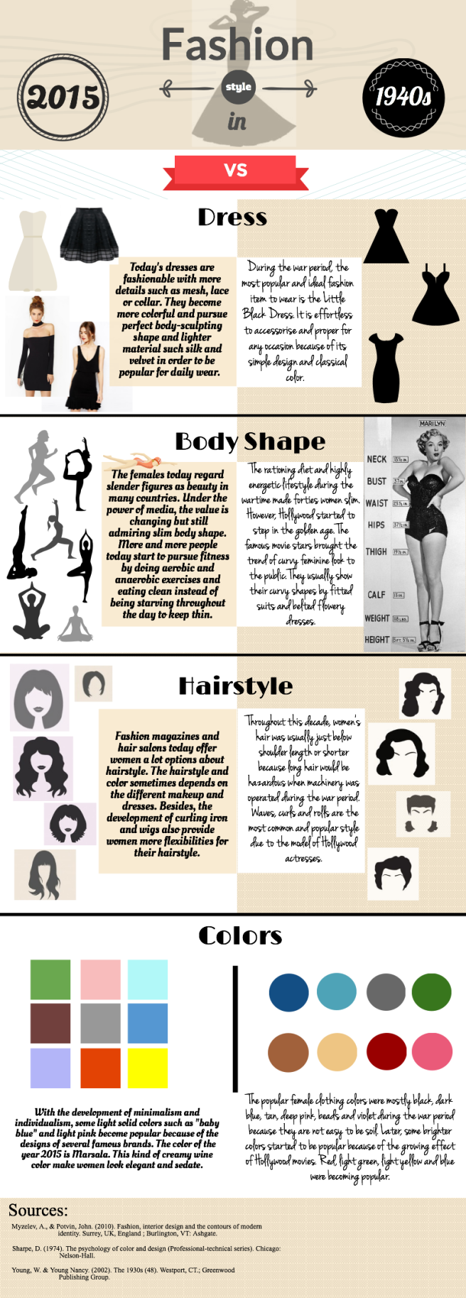
Fortunately, we can choose the topic that we are interested in for the Infographic assignment of my public relations class. I would like to share my work with you. It still has some problems but this time’s experience is a treasure for me.

There are many different types of Infographics. My instructor provided a really great source about 12 types of Infographics and I really wanna share with you. The most common types include the Infographics about a guide to do something, a statement with proof, some facts you should know and the format of versus. Mine should be the type of comparison. For me, this type will be more direct and interesting.


Untitled Infographic

My Infographic has a problem at the first, which is that I lost the point to explain why people should care about it. It is really easy to forget this point because usually you have wrote a memo for it or you have already kept that reason in mind so you just forget to add the reason in to your work. That make sense but will be a little pity.

The first key to a great Infographic should be starting with “why”. Audiences are attracted by your visual design and then come to enjoy your work can be a reason. But, you should explain why people should care about your topic; explain why your story is worthy to be cared about.

Besides, always know your audiences. Only in this way can we offer the valuable message that they want to know. Then, after you have your target audiences, you would better use relevant data, reputable sources and proper ikons and images to tell a visual story.

For making Infographic, I really recommend Piktochart, InDesign and Canva. They are easy to sign up and easy to handle.

At last, don’t forget, ALWAYS SAVE YOUR WORK and ALWAYS CITE YOUR SOURCES, seriously.

Tips for InDesign that I hope I had known when I was a beginner (Part 1)

I had no idea about how to use InDesign to complete my design work two years ago. What I knew at that time was the functions of each tools on the left sidebar. But, I knew nothing about about secret shortcut keys no mention to tips and tricks. And I know, most of you must be the same as me that we do not want to spend thirty minutes even longer to watch a super slow and boring Youtube tutorial video. Therefore, let me give you just a little treat about what you should be really careful about and what you would be better to know.

IMAGE FORMAT

Image format! Image format! Image format! It should be the most important thing you should know when you start out. InDesign indeed can import many formats for images that include JPEG, PNG, EPS, PICT, PDF, PSD and TIFF but you should know which format you need to use. If you want your work to be printed then you should make sure that they are in the acceptable format such as EPS, TIFF and PDF and stick with them.

MARGINS

Besides, make sure that your work is NO HIGHER than 100% of your size or you will be regret because they will be printed out as many separate papers. Normally, your printer will give you the measurements for the bleed but usually only 3mm or 1/8 inch should suffice. So, just set up the margins, bleed and the paper size for your work at the very beginning.

COLOR MODE

And to be safe, try to avoid JPEG because it is the format that is set as low-resolution. Then you should check that your work have the resolution of 300 PPI (pixels per inch) and always double check that the work is saved as CMYK color mode. Most of the images are set as RGB color mode at the beginning but after editing, we would better set them as CMYK because it is the most stable and color mode for printing.

I believe that most of handy and effective tips usually come from people’s personal experience. But if you still are looking for useful library of skills. I recommend Adobe InDesign CC for tutorials. They provide official key techniques for beginners.